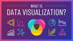
Python Data Analysis: Understanding Categorical Plots for Effective Data Visualization

Data analysis is a crucial step in extracting meaningful insights from your datasets. Python, with its extensive ecosystem of libraries, provides a powerful platform for data analysis and visualization. In this blog post, we will explore one essential aspect of data visualization in Python: Categorical Plots. Categorical plots help us visualize data with categorical variables, making it easier to understand patterns, relationships, and distributions. We’ll also discuss which types of plots to use for various data visualization scenarios.
Understanding Categorical Plots
Categorical plots, as the name suggests, are used to visualize data that falls into different categories or groups. These plots help us understand the distribution of data, relationships between variables, and the overall structure of categorical data. Python offers several libraries for creating categorical plots, including Seaborn and Matplotlib. Let’s dive into some of the most commonly used categorical plots and their applications.
1. Bar Plot
Bar plots are excellent for comparing categorical variables. They display the frequency or count of each category in a bar format.
Library: Seaborn
Code Example:
import seaborn as sns
import matplotlib.pyplot as plt
# Create a bar plot sns.barplot(x=”category”, y=”value”, data=df)
plt.show()
: Use bar plots to compare the frequency of categorical variables, such as product sales, survey responses, or customer ratings.
2. Count Plot
Count plots are a variation of bar plots used to count the number of occurrences of each category.
Library: Seaborn
Code Example:
import seaborn as sns import matplotlib.pyplot as plt
# Create a count plot
sns.countplot(x=”category”, data=df)
plt.show()
: Count plots are ideal for visualizing the distribution of a single categorical variable, like the number of people from different countries in a dataset.
3. Box Plot
Box plots are used to display the distribution of numerical data across different categories. They show the median, quartiles, and potential outliers.
Library: Seaborn
Code Example:
import seaborn as sns
import matplotlib.pyplot as plt
# Create a box plot sns.boxplot(x=”category”, y=”value”, data=df)
plt.show()
Use Cases: Box plots are great for comparing the distribution of a numeric variable within different categories, like comparing the salaries of employees in different departments.
4. Violin Plot
Violin plots are a combination of box plots and kernel density estimation, providing a more detailed view of the data distribution.
Library: Seaborn
Code Example:
import seaborn as sns
import matplotlib.pyplot as plt
# Create a violin plot sns.violinplot(x=”category”, y=”value”, data=df)
plt.show()
Use Cases: Violin plots are useful when you want to visualize both the summary statistics and the underlying distribution of data for different categories.
5. Pie Chart
Pie charts represent data in a circular format, showing the proportion of each category relative to the whole.
Library: Matplotlib
Code Example:
import matplotlib.pyplot as plt
# Create a pie chart
plt.pie(df[‘category’].value_counts(), labels=df[‘category’].unique(), autopct=’%1.1f%%’)
plt.show()
Use Cases: Pie charts are suitable for displaying the percentage distribution of categories, such as the market share of different products.
6. Heatmap
Heatmaps are used to visualize the relationship between two categorical variables, displaying the frequency or correlation between them.
Library: Seaborn
Code Example:
import seaborn as sns
import matplotlib.pyplot as plt
# Create a heatmap
pivot_table = df.pivot_table(index=’category1′, columns=’category2′, values=’value’, aggfunc=’mean’)
sns.heatmap(pivot_table, cmap=’coolwarm’, annot=True)
plt.show()
Use Cases: Heatmaps are suitable for visualizing the relationships and patterns between two categorical variables, like customer preferences across different product categories.
Conclusion
Python offers a plethora of tools and libraries for data analysis and visualization, making it a go-to choice for data scientists and analysts. Categorical plots, as discussed in this blog post, are essential for understanding and conveying insights from categorical data. By choosing the right categorical plot for your data and analysis goals, you can unlock valuable insights and communicate your findings effectively. Whether you’re comparing categories, showing distributions, or exploring relationships, Python’s data visualization capabilities have you covered. So, start exploring and visualizing your categorical data today!
Credits to :Mr. K. Kishore Kumar. MBA.,
Business Analyst Aspirant
linkedin.com/in/kishore-kavery-619135171

